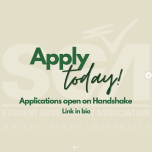
In general, a strong photo that shows action is going to be more effective on social media than a graphic with text on it. You want it to appear to be a natural part of social media, not an ad. However, if you absolutely must use a graphic, here are some guidelines to be more effective.
Use the correct size and orientation for your platform.
Every social media platform has unique specs depending on the type of media you are posting. Identify which platforms you wish to post to, what type of post it will be, and create a new design for each one. These sizes change periodically, so it’s a best practice to search online for the current dimensions before designing them.
Stay on brand.
If it is not on brand, it should not be on Wright State social media. Wright State’s colors are green and gold; those should be your primary colors. This provides an immediate cue to people scrolling through their feeds that your post is university related. You can find our colors, logos, downloadable fonts, and additional design guidelines in the university’s brand website at wright.edu/brand.
Like a billboard, keep the text to 3–7 total words.
Short. Concise. Impactful. Make sure it adheres to the university’s editorial style guide. Whenever possible, try to tie it to the current university messaging and existing campaigns. If there must be more than a handful of words, make two or three much larger and attention-grabbing, knowing the rest will only be seen by those who zoom in. All text should be repeated in the alt-description and body copy. Remember, your image will appear in conjunction with your handle/account name, so you do not need to put your name or individual unit logo/branding on your images.
Have a strong focus.
Do not use a photo of a crowd, collage, or other complex images. There should be an obvious visual hierarchy, such as featuring one or two people with everything else being clearly less important.
Use the 2x2 test.
When your graphic is viewed at 2 inches x 2 inches, can you still decipher everything in it within three seconds?
Do not use elements that are intended for print.
Print (posters, ads, flyers, brochures, etc.) and social media are not the same thing and are not interacted with in the same manner. For accessibility, all text should be in the body of the post, not in the image. In most cases, these things do not belong on a social media graphic:
- QR codes
- Detailed logos, graphics, charts, instructions
- Sponsors
- Email address
- Phone number
- Web address (if you must use a web address, keep it short! Request a custom redirect from the web team, e.g., wright.edu/redirect)
Let us help you!
The Office of Marketing has professional graphic designers, web designers, writers, and editors who can help your efforts be as effective as possible. Complete a project request form to get started.


